Century Gothic
Born in America in 1886, Sol Hess started his career with Lanston Monotype in 1902, after a three-year scholarship course at Pennsylvania Museum School of Industrial Design.
Century Gothic was designed between 1936 and 1947. It is a 1991 computer update of Twentieth Century which was itself a version of the famous Futura. It is very practical for headlines and general display work and for small quantities of text, particularly in advertising.
On the other hand, Century Gothic is within the sans serif geometrical type classification and its structure is a mix of very round curves and angular points. Futura typeface is based on strokes of near-even weight, which are low in contrast; Avenir typeface has some slightly humanist features that add warmth to the face, such as the tail on the “t” and the “o” that isn’t a perfect circle, and Century Gothic has no variance in stroke (no thick and thin) beyond the slightly wider tildes on the “i” and “j.” The characters are wide, but the weight is light. The lightness of the face may make it harder to read by those with eyesight issues, but it is heavy enough to be comfortable for most readers. Century Gothic offers variations, such as regular or normal, italic, bold, and bold italic.

Typeface’s standard Latin character set
Type contrast designs

Version 1: Contrast Element: Size , Color, and Position

Version 1: Contrast Element: Size , Weight, Position and Stress

Version 2: Contrast Element: Size , Weight, Position and Stress

Version 1: Contrast Element: Size and Color

Version 2: Contrast Element: Size and Color

version 1: Contrast Element: Color, Size, weight and Position

version 2: Contrast Element: Color, Size, weight and Position

Version 1: Contrast Element: Color, Size, and Position

Version 2: Contrast Element: Color, Size, and Position

Version 1: Contrast Element: Color, Size, and Position

Version 2: Contrast Element: Color, Size, and Position

Version 1: Contrast Element: Color, Size, and Position

Version 2: Contrast Element: Color, Size, and Position

Version 1: Contrast Element: Size, Color, and Weight

Version 2: Contrast Element: Size, Color, and Weight
Hierarchy designs with source page

Hierarchy designs with source page: Design 1

Hierarchy designs with source page: Design 2

Hierarchy designs with source page: Design 3

Hierarchy designs with source page: Design 4

Hierarchy designs with source page: Design 5

Hierarchy designs with source page: Design 6

Hierarchy designs with source page: Design 7
Hierarchy designs with text

Version 1: Flush left, u/lc, loose leading & tracking

Version 2: Flush left, u/lc, loose leading & tracking

version 1: Justified, all lowercase, loose tracking, tight leading

version 2: Justified, all lowercase, loose tracking, tight leading

version 1: Flush left, all caps, normal leading & tracking

version 2: Flush left, all caps, normal leading & tracking

version 1: Flush right; all lowercase, loose leading, normal tracking

version 2: Flush right; all lowercase, loose leading, normal tracking

version 1: Justified, all caps, tight leading & tracking

version 2: Justified, all caps, tight leading & tracking
Complete poster drafts

Version 1: hierarchy designs

Version 1: hierarchy designs

Version 1: hierarchy designs

Version 2: hierarchy designs

Version 2: hierarchy designs

Version 2: hierarchy designs

Version 3: hierarchy designs

Version 3: hierarchy designs

Version 3: hierarchy designs

Version 4: hierarchy designs

Version 4: hierarchy designs

Version 4: hierarchy designs

Version 5: hierarchy designs

Version 5: hierarchy designs

Version 5: hierarchy designs
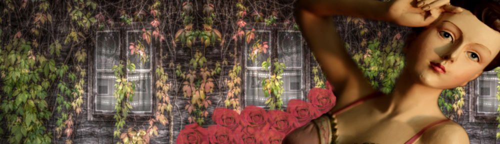
Final Poster

Final Version: hierarchy designs
